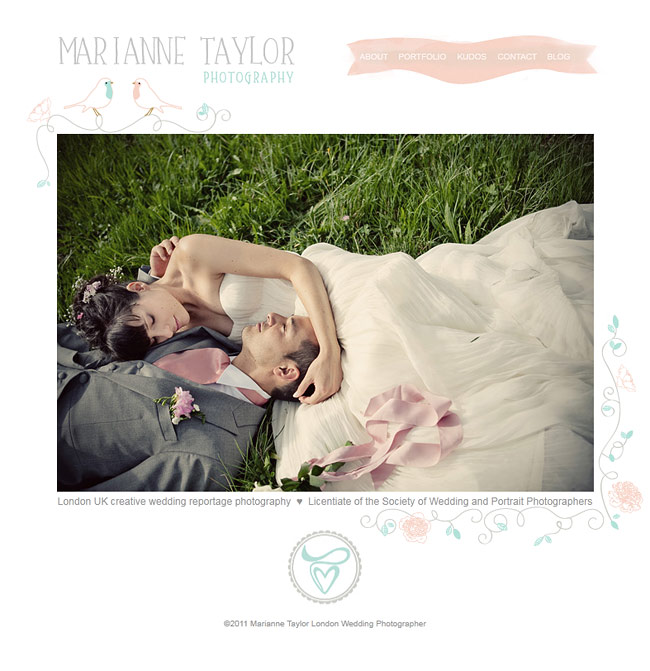
I hope you’re all having a lovely start to a new week! You might have noticed that my website has had a bit of a polish and is wearing new pretty graphics (if something is looking wonky, you might want to refresh your browser). The structure of the main site or the blog hasn’t really changed that much, as I’m a great believer in ‘if it’s not broken don’t fix it’, but for a long time I’ve been feeling that the overall design lacked some personality and femininity.
When it comes to the blog, while I appreciate that all sort of fancy sideways-scrolling cartwheel-spinning visual feasts are nice to look at, I’m such an old skool blogger at heart, that for me blogs need to first and foremost work as a reference library. Hence you will always find different ways to browse content, and links to archives, on my blog. Even if it doesn’t look as sleek as some other ways of presenting blogs, content will always be king in this particular one.
A huge thank you to Sabina from Design Garden, who created the beautiful graphics for me (I wanted something feminine, fun and reflecting my love of DIY) and Paul Thompson (who still after 10 years of coding my websites doesn’t have a site of his own), who implemented the changes.
So, do have a browse and take in the new look, I really hope you’ll like it! I appreciate all feedback you might have. In fact, at the end of the week I will draw two random people who comment on this post from the hat and send them a little surprise.
Hi, really love your new graphics! easy on the eye and not over-kill, very cool!
Aww, it’s great!! Very “you” and works perfectly with your gorgeous photography. Brilliant! xx
Loving the new graphics – it has romance and a carefree feel to it which is beautiful next to your work x
It’s beautiful and those birds are super cute. I also can’t thank you enough for keeping the general interface simple, it makes it so much easier to read. Plus any laptop running IE (not my own personal one I promise, I use firefox…) struggles massively with images on blogs so it’s great to still be able to load a page quickly. Can’t tell if you’ve tweaked your logo or not so either nice job to Sabina for designing the new elements to fit in perfectly or designing a new yet still familiar one to match!
Thanks Rachel! Yes, Sabina tweaked the logo to have a more ‘hand drawn’ look to it, while keeping the original design idea intact. :)
It’s lovely, soft and delicate. It suits the mood of your pictures and your style in general.
I’d probably darken the peachy-pinky stripe with the links a bit more as it would be more easy to see, but just a very little bit.
I love the pins on the right side, the font and the colours, which seem to be taken directly from one of your photos.
Great job Sabina and Paul!
Looks fab Marianne, love the colours- all so pretty and whimsical yet still simple a perfect amtch to you beautiful work.
It looks fantastic! Being a big fan of birds myself, I love your header!
Simple but effective and love the colour palette. Glad to see you’ve not changed the blog format, I too am a big fan of the keep it clean and simple. Navigation is key!
It’s lovely. Having everything such a pale tone really makes the photos pop out.
Love the design Marianne nice and organic. You must be really happy to have all done and dusted and looking good. I’ve been working on mine for an age now… think I just need to get someone to just do it now.
It’s lovely! And it’s always a pleasure to see your pictures! :)
Gorgeous, gorgeous, gorgeous!
I could wear your website around and it would be my favorite dress. I love it, amen.
I absolutely LOVE the new look! The ice-cream colours are scrummy and whimsical, you must be thrilled with it!
Very cute and feminine – exactly what you wanted. The only element that didn’t work for me or hasn’t been matched up to the rest of the re-style yet is the drop down lists on your heading tabs – perhaps they should be in the gorgeous greens too.
Love your work lady and very much hope we get to work together soon x
Just stunning Marianne; soft, gorgeous and oh so femininely {is that a word?!} pretty! Love it x
Love the new look, nice and light yet very romantic! I don’t know if others have difficulties seeing the pink font and the text on the pink background, that could maybe be tweaked a bit, to make it little easier to read and see. But otherwise, lovely and totally your style :)
I know the pink is not the easiest to read, but it should be only in places where the text is not so important (like the dates of blog features). It was a conscious decision to make less important information a bit less prominent. If it annoys a lot of people I will reconsider. :)
I’ve just visited for the first time and I love it instantly, I’m a huge sucker for feminine prettiness and you’ve achieved it perfectly without being ‘too over the top’!
I’m about to launch my new website in a few weeks so I 100% appreciate the thought and work that you’ve put into getting it looking this good!
Chloe xx
Love the color scheme, so soft and feminine!
So lovely, fresh and sweet! xx
Hey Marianne, sooo cute, those little birds. I love the new look fresh, spring, feminine! Well done!!!
Eva
I just had an ‘oooh!’ moment when your page loaded – The new design is beautiful and subtle and I adore the sweet little love birds!
I love it! I like how you kept the actual base of the blog the same as I feel this is really user friendly and I find I can get to what I want to look at very easily! I love the new colour scheme as it’s subtle yet still stands out and compliments your style of photography, soft, feminine and oh so beautiful! It’s nice it’s more personalised, so it’s more ‘you’! Also I love pastel shades!! So that’s always a winner for me! Plus those love birds are beautiful to!
Marianne, I love the soft, feminine look. Reminds me a bit of some of the planning blogs abroad. Very nice.
I love so adorable. Will take some getting use to I’ve been following this blog from the first post so, it was a shocker to see it so different. But it looks lovely!
The new look is very easy on the eye Marianne. I completely agree with your philosophy – content should be king (and you certainly have that). Many blogs (and websites) are triumphs of style over content.
I really like the new graphics, they’re a lot more personal and…approachable. Not so rigid and official. Very feminine, lovely :)
I love how that picture picks out the colours of the header and page banner. You can’t go wrong with pink and blue can you? This is really lovely. I always liked the old website design but I always think that until I see the new and improved one! x
The new look is awesome Marianne. I think you accomplished your goal to soften things up nicely. Really beautiful design work all around. Congrats.
I love the new design. I think is reflects your style perfectly. I loved the old design, but this definitely has more personality behind it.
Love it!
I love your site, I love your pictures and I love discover such beautiful weddings on your website ! Winter was so long … ;-)
Your new theme is so cute and delicate … Good job !
In case anyone missed it, I drew the surprise winners live on Twitter. Results here: http://twitpic.com/4i95ro
Also, thank you to everyone for your feedback, you’re all so lovely! xx
It’s looking stunning… a perfect compliment to you and your photography x
This is lovely. Nice photography and the backdrop, heck, nothing as romantic. I love it.